Help Docs
Create Graphs and Charts from JSON/XML/Excel data
For pictorial presentation of data, grapahs and charts are preferred. Using EDocGen, you can create graphs and charts in your PDF and Word templates from JSON/XML/Excel data. The system supports population of Pie Charts, Bar Charts, Column Charts, and Area charts.
For colors, either you can specify Hex color code or color name.
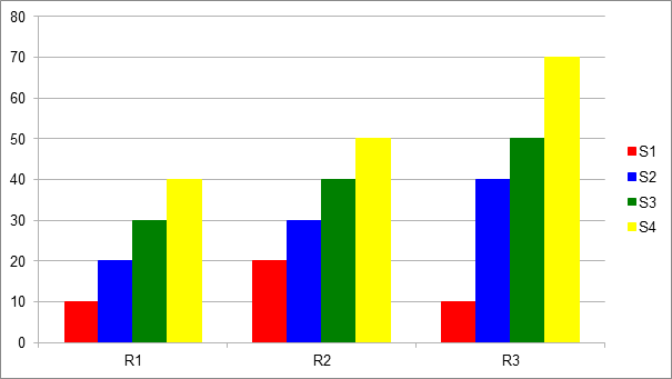
- {\ccolchartid} is the tag for column chart creation. Populate the following JSON to create the Column chart.
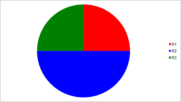
- {\cpiechartid} is the tag for column chart creation. Populate the following JSON for creating the Column chart.
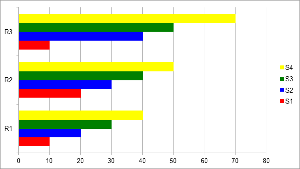
- {\cbarchartid} is the tag for column chart creation. Populate the following JSON for creating the bar chart.
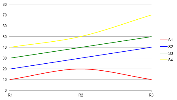
- {\clinechartid} is the tag for column chart creation. Populate the following JSON for creating the line chart.
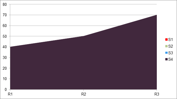
- {\careachartid} is the tag for column chart creation. Populate the following JSON for creating the area chart.
"colchart1": {
		"seriesLabel": ["S1", "S2", "S3", "S4"],
		"rowLabel": ["R1", "R2", "R3"],
		"seriesColor": [ "red", "blue", "green", "yellow"],
		"rowColor": ["red", "blue", "green", "yellow"],
		"value": [
			[10, 20, 30, 40],
			[20, 30, 40, 50],
			[10, 40, 50, 70]
		]
	}
"piechart1": {
		"seriesLabel": ["S1", "S2", "S3", "S4"],
		"rowLabel": ["R1", "R2", "R3"],
		"seriesColor": [ "red" ],
		"rowColor": ["red", "blue", "green", "yellow"],
		"value": [
			[10, 20, 30, 40],
			[20, 30, 40, 50],
			[10, 40, 50, 70]
		]
	}
"barchart1": {
	    	"seriesLabel": ["S1", "S2", "S3", "S4"],
	    	"rowLabel": ["R1", "R2", "R3"],
                "seriesColor": ["red", "blue", "green", "yellow"],
                "rowColor": ["#0000ff", "#ff1100", "#556688" ],
		"value": [
			[10, 20, 30, 40],
			[20, 30, 40, 50],
			[10, 40, 50, 70]
		]
	}
"linechart1": {
		"seriesLabel": ["S1", "S2", "S3", "S4"],
		"rowLabel": ["R1", "R2", "R3"],
		"seriesColor": [ "red", "blue", "green", "yellow"],
		"rowColor": ["red", "blue", "green", "yellow"],
		"value": [
			[10, 20, 30, 40],
			[20, 30, 40, 50],
			[10, 40, 50, 70]
		]
	}
"areachart1": {
		"seriesLabel": ["S1", "S2", "S3", "S4"],
		"rowLabel": ["R1", "R2", "R3"],
		"seriesColor": [ "red" ],
		"rowColor": [],
		"value": [
			[10, 20, 30, 40],
			[20, 30, 40, 50],
			[10, 40, 50, 70]
		]
	}