Let's be honest, we’ve all been there. It's the end of the day, you're about to send off a critical report, and you spot it: last-minute data changes. That sinking feeling hits as you realize you have to manually re-export every single chart. It’s not just a tedious chore; it's a massive productivity drain and a perfect recipe for embarrassing, preventable errors.
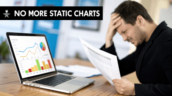
A simple data refresh can snowball into a mountain of manual work, and with every copy-paste, the risk of human error skyrockets. This is exactly the headache that platforms like EDocGen are designed to eliminate. Instead of treating charts as static, disconnected images, EDocGen links them directly to your data, transforming painful updates into a seamless, automated process.
The core issue with static charts is that they break the link between your data and the visualization. Every time your data changes, you have to manually re-forge that link, opening the door to inconsistency, inefficiency, and costly mistakes.
The difference is night and day. Adopting a dynamic approach isn't just about saving time; it's about making your entire reporting workflow more reliable, scalable, and professional.
Industry analysis backs this up. Companies that switch to dynamic chart features see a stunning 65% reduction in manual data update times. For IT teams at major banks, this automation cut the time spent on monthly financial reports from 15 hours per week down to almost nothing, while slashing error rates that previously hit 28% .
By 2026, projections show that 85% of Fortune 500 companies will require dynamic charts in their automated documents to sharpen their decision-making. The need to is no longer a luxury—it's essential for staying competitive.
This is where a purpose-built solution really shines. While you could try to wrestle with complex macros or basic mail-merge functions, they just don't offer the scalability, security, or ease of use needed for business-critical applications. EDocGen gives you a better way forward with a no-code interface and a robust API, designed specifically to add dynamic charts to generated documents reliably and at any scale.
If you're stuck in a cycle of manual updates, our guide on Excel reporting automation can show you a clear path to breaking free.
The secret to adding dynamic charts to your documents without a headache isn't some complex technical trick—it all comes down to clean data and a well-thought-out template. If you get this foundation right, the rest of the automation process becomes surprisingly straightforward.
Think of your data as the fuel for your chart. Whether that data lives in a JSON payload, an XML feed, or a simple Excel spreadsheet, its structure is what matters most. Messy, disorganized data will only lead to errors and frustration down the line.
For EDocGen to draw a chart, it needs a clear set of instructions. This means your data has to be organized in a way the system can easily digest. The most reliable format is an array of objects , where each object represents a single data point on your chart.
Let's say you're building a bar chart to display quarterly sales figures. Your JSON data should be structured like this:
This structure is beautifully simple. The salesData key points to our array, and inside, each object has a clear label ( quarter ) and a value ( revenue ). This direct mapping tells EDocGen exactly what to plot on the X and Y axes, no guesswork required.
Once your data is in good shape, it's time to set up your Word, PowerPoint, or Excel template. This is where you'll tell EDocGen where the dynamic chart goes and which data to use. The whole thing is handled with a simple tagging syntax right inside your document.
First, create a chart in your document just as you normally would. Then, the key is to use the chart's "Alt Text" description field to place an EDocGen tag. This tag acts as a placeholder that connects the chart in your template to your data source.
A typical tag will look like this: {cht:salesData} .
· cht is the instruction that tells EDocGen this is a chart.
· salesData is the key from your JSON that contains the chart's data array.
This simple connection is what drives the automation. When you generate a document, EDocGen finds that tag, grabs the salesData array from your payload, and builds the chart using your latest numbers.
The real power here is reusability. After you've tagged a template once, you can generate thousands of unique reports from that single master document. Each one will have its own up-to-date, customized chart. It's a huge leap from systems that force you to hardcode chart logic or create different templates for every single variation.
One of the most important decisions you'll face is whether to generate native Office charts or rendered chart images . EDocGen handles both seamlessly, and each serves a very different purpose.
· Native Office Charts: These are fully editable charts that live inside the generated Word, PowerPoint, or Excel file. They’re perfect for internal reports or any document where a colleague might need to adjust the chart’s style, colors, or even tweak the data points after it's been generated. This keeps things flexible for your team.
· Rendered Chart Images: These are static images (like a PNG or JPG ) of your chart. This approach is ideal for documents that need to be locked down and professional, such as client proposals, official reports, or PDFs. Because the chart is just an image, its appearance is fixed, guaranteeing brand consistency and preventing anyone from accidentally changing it. If you want to learn more about image handling, check out this guide on populating documents with dynamic images .
Picking the right format is crucial. Having the choice gives you the control to match the output perfectly to what your business actually needs.
So, you’ve cleaned up your data and tagged your templates. You see just how easy it is to add dynamic charts to generated documents . We’ll cover both the no-code path for business users and the API-first approach that developers love.
Let's imagine you're a sales ops manager. You need to create quarterly performance reports for your entire sales team, and each report must have a personalized chart showing that specific rep's performance against their quota. Let's get it done.
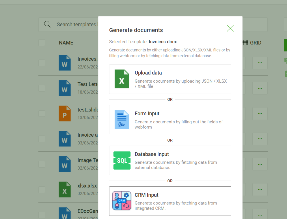
For business users or teams that aren't deep into coding, EDocGen’s web UI offers a simple, click-based experience. You won’t write a single line of code to get from your raw data to a polished, professional document.
You just need to provide your data source (like JSON or Excel), upload the document template you've already prepared with chart tags, and then generate the document. That's it. The dynamic chart populates automatically.
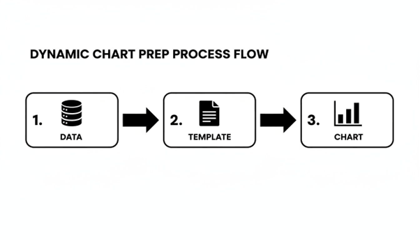
This diagram shows just how straightforward the process is: data flows through your tagged template and comes out as a finished document with a perfect visual. This simplicity is a huge deal. EDocGen streamlines the entire journey from data to document.
Here’s a quick look at how it works in the UI:
· Upload Your Template: Head to the "Templates" section and upload your tagged Word, PowerPoint, or Excel file. EDocGen automatically picks up on the chart tags you’ve added.
· Connect Your Data: You have two options here. You can either upload a data file (like a spreadsheet of your sales figures) or just paste your JSON/XML data directly into the text box.
· Generate Your Document: Simply hit the "Generate" button. EDocGen merges the data and template, draws the dynamic chart, and gives you the final document to download.
In just a few clicks, you have a personalized report. Do this for every sales rep, and you’ve just automated a task that used to eat up hours. You can always dig deeper into our detailed guides for more on handling graphs and charts within the platform.
For developers who need to weave chart generation into their own apps or run high-volume production jobs, our REST API is the answer. You can programmatically generate thousands of documents with a single API call containing your template ID and data payload.
This is perfect for things like a customer portal that generates account statements on demand or a nightly batch process that creates daily operational reports. The API call itself is clean and simple. You just make a POST request to our generation endpoint, point to the template you want to use, and provide the data in the request body.
Here’s a sample JSON payload for that sales report we talked about:
When you fire off this payload, EDocGen creates a report for Jane Doe. It uses the salesData array to plot a chart comparing her actual sales to her quota for each month. This ability to work with structured, nested data is a major advantage. While some other platforms choke on complex data or require you to flatten everything first, EDocGen is built to handle the messy, real-world data structures common in enterprise systems.
The need for this kind of capability is growing fast. A recent Forrester study revealed that 78% of insurance departments now require embedded visuals in reports just to keep up with a 150% growth in data volumes. To really make the most of dynamic charts, you have to get your approach to data visualization and analytics right.
For instance, a large real estate firm we work with uses EDocGen with its Salesforce integration to generate 500,000 personalized property reports each quarter. Every report features dynamic charts showing ROI projections, a process that has slashed their operational costs by $2.3 million annually.
Once you’ve got the hang of creating basic charts, you can start digging into the more advanced features. This is where EDocGen really shines, especially for complex enterprise needs. We're talking about moving beyond static visuals to create documents that intelligently adapt to the data they’re presenting.
Think of it as teaching your templates to make decisions on their own.

Let's say you're generating a portfolio performance report. A standard bar chart works great for showing positive growth. But what happens if a fund underperforms? Showing that negative growth with the same green bar chart doesn't really land the message.
This is where conditional logic comes in. You can tell your template to show or hide different charts based on the actual data values.
For instance, you could set up a single template to:
· Show a green bar chart if the quarterly_growth value is positive.
· Swap to a red line chart to really emphasize a downward trend if that same value is negative.
This is a huge step up for creating nuanced, insightful reports. With other platforms, you’d be stuck building and maintaining separate templates for every possible scenario—a real headache. With EDocGen, all that logic lives inside one smart template.
What if you need a single document that contains charts for every department in your company? Or maybe a performance review with a unique chart for each KPI? This is a perfect job for looping.
By structuring your data with nested arrays, you can use a loop block to go through a list and generate a distinct chart for each item. You can check out our guide on how to use loops and repeat sections to see this powerful feature in action. It's a critical capability for enterprise use, where one report often needs to pull together information from all over the business.
The combination of conditional logic and looping is incredibly powerful. You could, for instance, loop through a list of regional sales teams and, for each one, conditionally display either a "Target Met" or "Target Missed" chart. This level of automation is where you see massive ROI.
For many businesses, the real test isn't just quality—it's scale. Generating one perfect report is one thing, but producing 100,000 personalized loan statements overnight is where the value really kicks in. EDocGen was built for exactly this kind of high-volume work.
You can schedule bulk generation jobs to run at specific times, like right after your data warehouse finishes its nightly update. This means thousands of personalized, chart-filled documents are ready and waiting when your team gets to their desks in the morning.
Dynamic charts are now a vital part of high-volume document production. In life sciences, a PwC survey found 67% of teams slashed audit prep time by 70% (from 20 days down to 6) simply by using auto-updating visuals. This is the kind of thing platforms like EDocGen enable. A mid-sized bank, after a 2024 integration, now produces over 100,000 loan statements a month, complete with charts showing delinquency rates. This has improved their risk assessment accuracy by 45% and saved an estimated $1.5 million in potential losses.
Let’s look at how this plays out in a few different industries:
· Banking: A bank can generate monthly loan statements for every single customer, each including a dynamic line chart showing their personal loan amortization schedule. It clearly visualizes the principal and interest paid over time.
· Insurance: An insurance company automates its quarterly policy reviews for corporate clients. Each report can include a dynamic pie chart breaking down claims by category and a bar chart visualizing the policy's performance against industry benchmarks.
· Human Resources: An HR department automates annual employee performance reviews. The final document pulls data from the HRIS to create charts visualizing an employee's goal attainment, peer feedback scores, and progress on training.
In each of these scenarios, the ability to add dynamic charts to generated documents isn't just a nice-to-have feature. It’s the core of an efficient, scalable workflow that delivers insights and saves countless hours of manual work.
What really sets EDocGen apart is its unified design. We've built a powerful, easy-to-use no-code UI that lets your business teams create and manage templates on their own, without ever needing a developer. At the same time, our API-first architecture gives your IT and integration teams all the power they need for high-volume, automated workflows.
This isn't just a nice-to-have feature; it’s our core philosophy. It means:
· Your marketing team can independently add new charts to a sales proposal template.
· Your developers can hook EDocGen into your CRM to generate 50,000 account statements overnight.
Both teams operate on the same platform, which keeps everything consistent and on-brand, but they never get in each other’s way. This avoids that all-too-common problem where business teams are stuck waiting on IT for every tiny template tweak, grinding operations to a halt.
EDocGen was built to handle complex JSON and XML natively, including nested objects and arrays. You can take the data straight from your enterprise systems and use it as-is.
Think of a sales report that needs to loop through regional teams, and for each team, loop through individual reps to generate a performance chart. EDocGen handles this nested logic effortlessly within a single template. This capability is essential for creating the rich, detailed documents that large organizations depend on.
For any enterprise, security is non-negotiable. It's another area where we stand apart from many cloud-only tools. EDocGen gives you flexible deployment options that put your IT team firmly in the driver's seat.
|
Security Feature |
EDocGen Offering |
Why It Matters for Enterprises |
|
Data Encryption |
AES-256 encryption for data in transit and at rest. |
Protects your sensitive financial, customer, and employee data from unauthorized access, helping you meet strict compliance standards. |
|
Deployment Options |
On-premise, private cloud, or our secure SaaS platform. |
Gives you full control over your data environment, ensuring you can meet any regulatory or internal governance requirements. |
|
Access Control |
Granular user permissions and role-based access. |
Ensures that only authorized users can create, modify, or access document templates and sensitive data. |
EDocGen gives you the choice. Our on-premise deployment is especially critical for companies in highly regulated sectors like finance, insurance, and healthcare. If you want to dig deeper, you can see the full scope of our features for enterprise document automation .
Ultimately, choosing a platform to add dynamic charts to generated documents is a strategic move. It's about more than just making pretty graphs. It’s about investing in a scalable, secure, and flexible solution that empowers your entire organization, delivers a fast ROI, and is built to handle the rigors of enterprise automation without cutting corners.
Yes, absolutely. This is one of the first things people ask. EDocGen was designed to work with your data as-is, and that includes standard Excel files.
You can point directly to a structured Excel sheet and use it as the data source for your charts. If you're dealing with more complex or even messy, unstructured data, our AI-powered features can parse and map that information to your template tags. It saves a massive amount of prep time and lets you start automating right away.
This is where the "dynamic" part really proves its worth. With EDocGen, your charts automatically scale to fit whatever data you feed them.
Think about it: for your Q4 report, you might send 12 months of sales data, and the chart will render perfectly with all 12 data points. But when Q1 comes around and you only have three months of data, the chart just adapts. It shows those three points without you having to lift a finger.
The system is smart enough to adapt to the data volume in your JSON, XML, or spreadsheet. You don't have to create different templates for different data ranges or manually reconfigure anything. This guarantees an accurate, properly scaled visual every single time—a huge step up from tools that lock you into fixed data structures.
Security isn't just a feature for us; it's non-negotiable, especially for the enterprise clients we work with. We've built several layers of protection right into the platform.
· Encryption: All your data is locked down with AES-256 encryption , both when it's moving and when it's stored.
· Deployment Flexibility: We give you the choice of on-premises or private cloud deployment. This puts your IT team in the driver's seat, giving them complete control over the data environment—a critical option many cloud-only tools can't offer.
· Compliance: The platform is built from the ground up to meet strict regulatory standards, ensuring your financial, customer, and internal data stays secure.
This layered approach means that when you add dynamic charts to generated documents , you're not opening up a new security risk.
Of course. A single template can hold as many charts as you need, and they can all be different types. This is how you build rich, data-dense documents that tell a complete story.
For instance, a single annual report could easily feature:
1. A pie chart to visualize market share.
2. A bar chart showing quarterly revenue.
3. A line chart illustrating year-over-year growth trends.
Each chart is tied to its specific data through unique tags in the template, so you have total freedom to design comprehensive reports. That’s a capability far beyond the single-chart limits you find in simpler tools.
Ready to stop manually updating charts and start automating your reports? See how EDocGen makes it easy to add dynamic, data-driven visuals to your documents at scale. Get started with EDocGen today .