At its core, automating report generation means using software to grab data, plug it into a template, and then shoot out the finished reports on a schedule you set. This simple switch gets rid of mind-numbing manual work, cuts down on human error, and gives you the insights you need to make smarter, faster decisions.
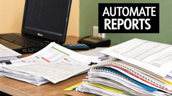
If your team is still cobbling reports together by hand, you're losing a lot more than just time. Manual reporting is a massive resource drain, trapping your business in a cycle of inefficiency that kills growth and strategic thinking.
Some teams use reporting tools and mail merge for generating reports. They have severe limitations.
The real cost here isn't just the hours burned; it's the lost competitive edge. Your team can't focus on what actually moves the needle: interpreting data to spot growth opportunities. This is exactly where you can automate report generation and completely flip the script.
Moving to automation isn't just a nice-to-have; it's a business necessity. The global industrial automation market is expected to reach $226.8 billion by 2025. That growth is backed by real results, with 90% of workers reporting that automation makes them more productive and companies seeing an average 22% drop in operating costs.
The goal is to shift your team from being data collectors to data strategists. Automation frees up their mental energy for high-value work like trend analysis, forecasting, and strategic planning.
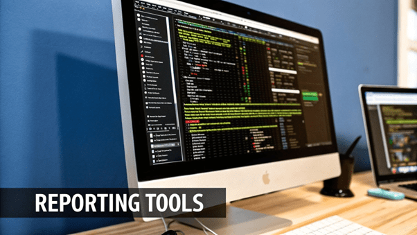
Here's a quick look at the EDocGen platform, which is built to handle these exact processes.
A centralized system brings together templates and data sources, which is the heart of any effective automated reporting setup.
Before you dive headfirst into automation, there's a bit of groundwork to cover.
Think of this prep phase as your foundation. Get it right, and every report you generate from here on will be accurate, reliable, and trustworthy.
EDocGen, like most automation platforms, loves well-organized data. The most common formats you'll work with are Excel or JSON or XML.. The system also supports population of data from databases, CRMs, and other business systems.
For a deeper look at how this all fits together, check out our guide on document automation platform
This is where the magic really happens. Your template is the blueprint for every automated report you generate. It's not just about looks; it's about building a smart, reusable asset that knows exactly where to plug in your data.
Think of it as the foundation. Get this right, and everything that follows becomes incredibly simple.
The whole system works because of dynamic placeholders, which we just call "tags." These are little markers you pop into your template that tell the platform what to do. When the automation runs, it finds each tag and swaps it with the right piece of data from your connected source. It’s this simple idea that unlocks the ability to automate report generation on a massive scale.
Let’s walk through a real-world example I see all the time: a client-facing project status report. Instead of a project manager spending hours every Friday manually updating a Word doc, we're going to build a template that pulls in all the latest info automatically.
You start with a standard document, probably in Microsoft Word. From there, you just identify the pieces that change week to week and replace them with dynamic tags.
It might look something like this:
This method gives you killer consistency and accuracy. The static parts—like your company logo, branding, and section titles—stay put, while all the variable data gets a fresh update every time.
A well-designed template does more than just present data; it tells a story. By structuring your placeholders logically, you guide the reader’s attention to the most critical information, like budget overruns or upcoming deadlines.
To help you get started, here's a quick reference table with some common data points and the placeholder tags you could use. This should help you visualize how your raw data connects to the finished report.
Key Dynamic Tags for Your First Report Template
|
Data Point |
Example Placeholder Tag |
Common Use Case |
|
Client Company Name |
{client_name} |
Report titles and headers |
|
Monthly Revenue |
{monthly_revenue} |
Financial summaries and dashboards |
|
Key Performance Indicator |
{kpi_metric_1} |
Performance tracking sections |
|
Team Member Task List |
{#tasks}{task_name}{/tasks} |
Project management updates |
|
Performance Chart |
{chart_sales_q1} |
Visual data representation |
This isn't an exhaustive list, of course, but it covers the basics you'll need for most standard business reports. Apart from dynamic text and table, you can populate images, charts & graphs, hyperlinks, QR Codes, etc.
Just because a report is automated doesn't mean it should look generic. Your brand's visual identity is a mark of professionalism, and it builds trust. EDocGen lets you bake your branding directly into the template, so every single document that comes out is polished and instantly recognizable as yours.
First, add your company logo to the header or footer. Simple.
Next, define your brand’s color palette for headings, charts, and tables. You can also set specific fonts to make sure everything aligns with your corporate style guide.
Once you embed these elements, you've created a master template that enforces brand consistency across every report. It doesn't matter who runs the automation or what data is being used. This kind of attention to detail is what turns a basic data dump into a high-quality, professional communication tool.
Okay, so you've got your dynamic template designed and ready to go. Now for the fun part: plugging in the data. This is where you connect your raw information—whether it’s tucked away in a spreadsheet or a live database—to your polished design. It's the critical link that truly puts the "auto" in automate report generation.
The real magic here is something called data mapping. Think of it as giving your template a GPS. You're simply telling the system, "Hey, see this column in my spreadsheet? I want it to go into this specific placeholder in my report." It's what ensures the right numbers and text land in the right spots, every single time.
This visual lays out the entire flow, from grabbing the data to shipping out the final report.
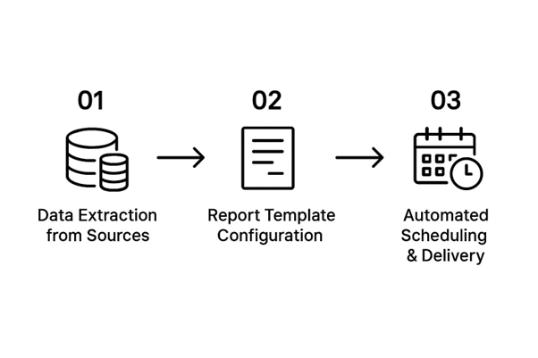
A centralized system brings together templates and data sources, which is the heart of any effective automated reporting setup.
As you can see, connecting your data is the central hub between your template design and your automated delivery schedule.
EDocGen is flexible, offering a few different ways to link up your data. The best method really just depends on where your data lives and how fresh it needs to be.
The push for this kind of intelligent automation is growing fast. In fact, the market is expected to hit $17.95 billion by 2025, largely because businesses need to connect all these different data sources to systems that can make sense of them.
Okay, you've done the heavy lifting. Your dynamic template is built, and your data source is hooked up. Now comes the best part—the "set it and forget it" moment where you truly automate report generation. This is where all that setup pays off, freeing up your team from repetitive tasks so they can focus on what actually matters.
The scheduling feature in EDocGen is basically your command center for automation. You get to decide the exact rhythm for your reports. Need a daily performance snapshot? Done. A weekly project update? Easy. A monthly financial summary? No problem. This completely removes the need for someone to manually kick off the process and guarantees stakeholders get what they need, right on time, every time.

Let's think about a real-world scenario. Imagine a financial controller who sends monthly expense reports to ten different department heads. That used to eat up half a day of her team's time with mind-numbing, tedious work.
With EDocGen, she can set up a single automated workflow that runs like clockwork on the first business day of every month. The system handles everything from there.
It will automatically:
This kind of consistent delivery builds trust and, more importantly, lets the finance team shift from just compiling data to actually analyzing spending trends.
The real power isn't just generating the report; it's getting it into the right hands at the right time. Smart distribution is what closes the loop on automation, turning raw data into actionable intelligence without any friction.
And you're not just limited to email. You can get pretty creative with how you deliver these reports to fit exactly how your team works.
Marketing automation is a perfect example of this in action. It's no secret that over two-thirds of marketers see automation as essential for keeping customers. In fact, 70% of marketing leaders are planning to increase their investment in it. Automating campaign reports gives them the timely business intelligence they need to prove ROI without the manual grind.
For a deeper dive, check out our complete guide to report automation. The core ideas of setting up schedules and distribution channels are universal across almost every industry.
By setting these workflows up just once, you're building a reliable system that keeps delivering value on its own.
Flexibility is everything, and modern automation tools are built for it. You can hook up a surprisingly wide range of data sources, so no matter where your information lives, you can pull it right into your workflow.
Typically, you're looking at a couple of main options:
The beauty of this is you don’t have to completely overhaul your existing data setup. The system adapts to you. If you’re heavy on spreadsheets, our guide on Excel reporting automation has some great tips.
Absolutely. In fact, this is where you’ll see some of the biggest wins. A wall of numbers can be a real headache, but a sharp-looking chart tells a story instantly. Tools like EDocGen are specifically designed to handle data visualization on the fly.
You just set up your template with placeholders for charts, graphs, or tables. When the automation runs, it grabs your fresh data and uses it to build those visuals. Imagine automatically creating a bar chart from your monthly sales figures or a pie chart breaking down budget allocation. It makes your reports far more insightful and much easier for stakeholders to digest.
Security is non-negotiable, especially with sensitive business data floating around. Any reputable platform will have multiple layers of security baked in to protect your information from start to finish.
Trust in your automated system is built on its security. Without it, the efficiency gains are meaningless. Ensure any platform you choose offers robust protection that aligns with your company's compliance standards.
Standard security measures often include password protection for individual documents and secure, encrypted email connections for sending them out. When you integrate with cloud storage like Google Drive or Dropbox, you can lean on their native access permissions, giving you really granular control over who sees what. It's always worth taking the time to configure these settings to match your company's security policies.
Ready to stop wasting time on manual reports and start making data-driven decisions faster? EDocGen gives you the power to automate report generation from any data source, creating polished, professional documents on a schedule that works for you.